Comfy Stylish, EMIS
이미스
- Graphic Design
- Web Development
- Information Architecture
- E-COMMERCE
- Web Design
2025
EMIS

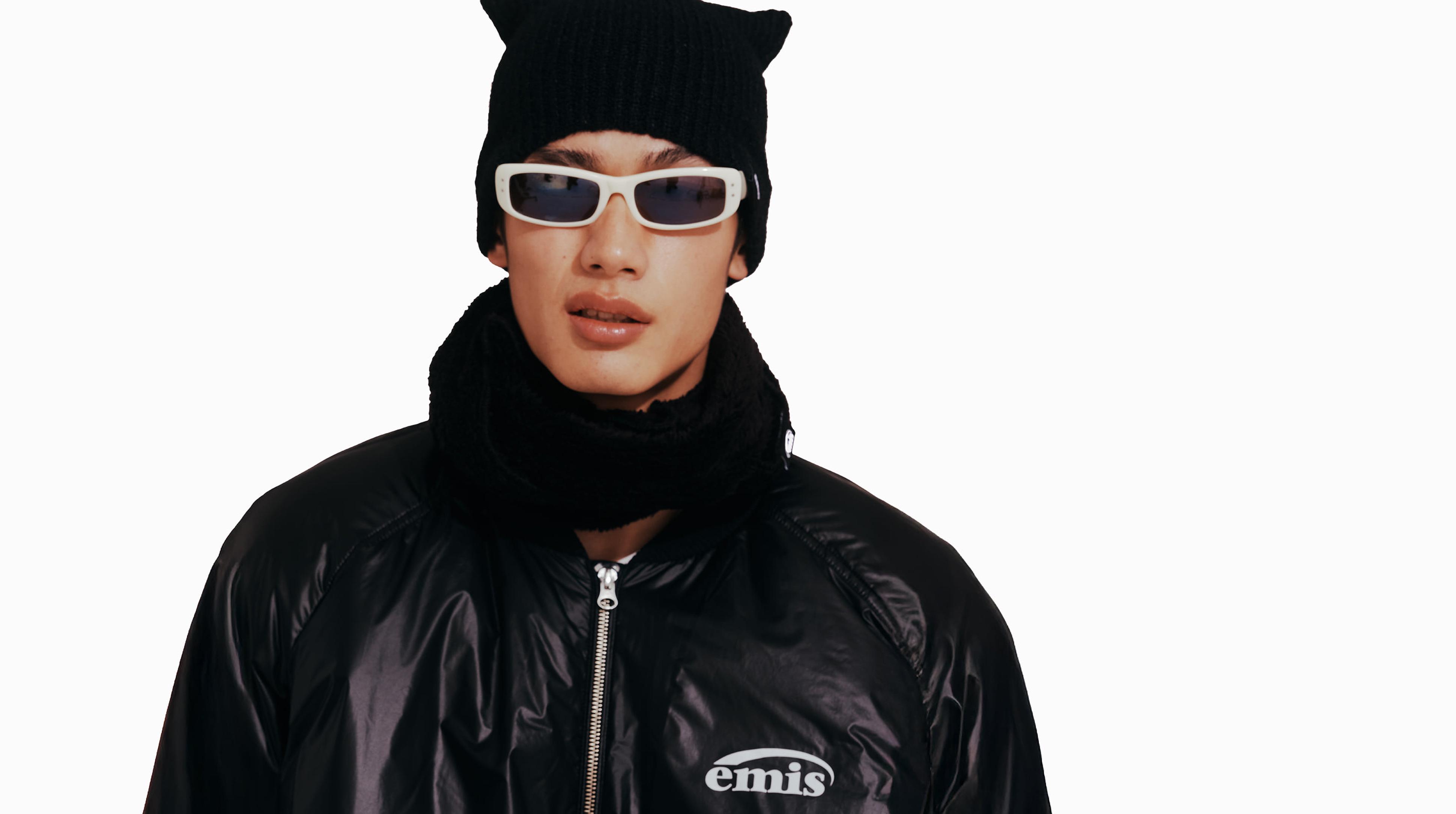
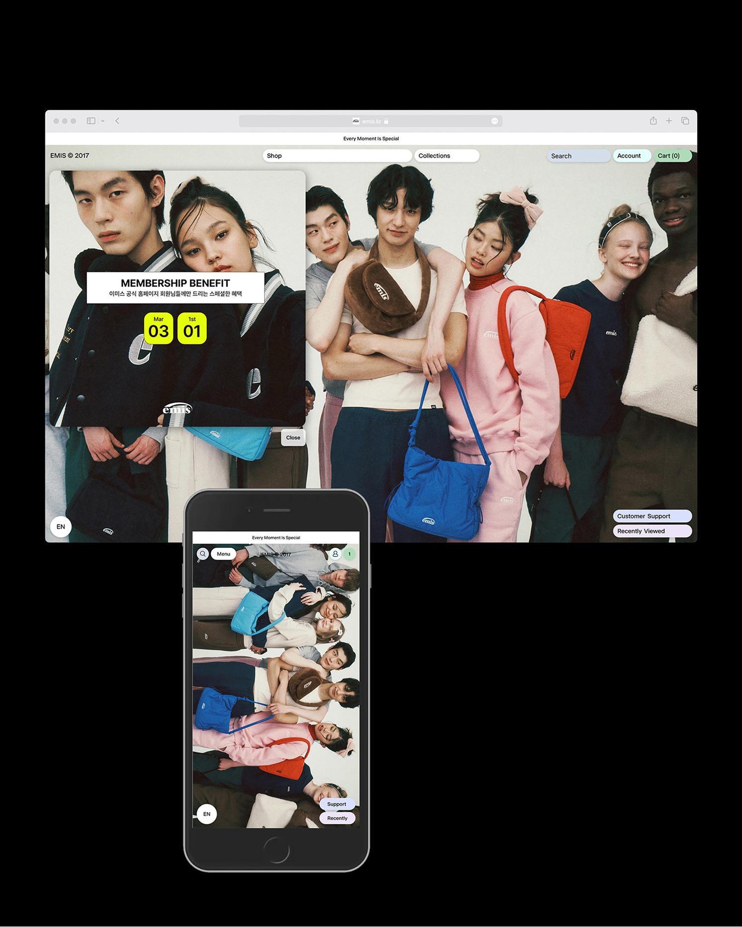
OTP Company translated EMIS’s everyday sense of variety and comfort into product discovery and shopping experiences, planning, designing and developing its Korean and global e-commerce websites. From the structure for comparing and choosing products, colors and sizes to the management of brand content and merchandise, we designed an experience supported by ongoing maintenance and improvements to purchase interfaces, categories and promotional areas through 2026.
OTP Company는 EMIS가 가진 일상 속 다채로움과 편안함의 감각을 상품 탐색과 구매 경험으로 연결하며, 국내와 글로벌 이커머스를 기획·디자인·개발했습니다. 다양한 상품과 색상·사이즈를 비교하고 선택하는 구조부터 브랜드 콘텐츠와 상품을 관리하는 운영 방식까지 설계하고, 출시 이후 2026년까지 구매 화면과 카테고리, 프로모션 영역의 유지 및 보완을 통해 일관된 브랜드 경험을 지원했습니다.
Purpose. Turning Variety into Effortless Shopping.
The central challenge of the EMIS e-commerce renewal was to help customers easily discover and choose products across a broad range of fashion and accessory categories, colors and sizes. As the brand grew and expanded into new categories, it needed a clear structure that could express its variety without making browsing and purchasing more complex. We sought to create a comfortable and engaging shopping experience for both customers looking for another color of a familiar product and those discovering something new. OTP Company approached the renewal through three perspectives: Available, representing usability and accessibility; Attractive, representing visual appeal; and Affordable, reflecting the brand’s approachable character. While preserving the everyday familiarity and expressive character of EMIS, we designed a journey that connects the pleasure of browsing with choosing and purchasing. We also considered the different purchasing conditions of Korean and global markets, alongside the ongoing work of updating products and content.
목적. 다채로운 선택을 편안한 쇼핑으로.
EMIS 이커머스 리뉴얼의 핵심 과제는 폭넓은 패션·잡화 카테고리와 다양한 색상·사이즈 안에서 고객이 원하는 제품을 쉽게 발견하고 선택하도록 만드는 것이었습니다. 브랜드의 규모가 성장하고 다양한 카테고리로 확장되면서, EMIS가 가진 다채로움을 충분히 보여주면서도, 많은 선택지가 탐색과 구매의 복잡함으로 이어지지 않도록 명료한 구조가 필요했습니다. 익숙한 제품의 다른 색상을 찾는 고객과 새로운 상품을 발견하는 고객 모두에게 편안하고 흥미로운 쇼핑 경험을 제공하고자 했습니다. OTP Company는 사용성과 접근성을 뜻하는 Available, 시각적 매력을 뜻하는 Attractive, 부담 없이 다가갈 수 있는 브랜드의 성격을 담은 Affordable을 리뉴얼의 세 가지 관점으로 삼았습니다. EMIS의 일상적인 친숙함과 감각적인 개성을 유지하면서, 고객이 다양한 상품을 둘러보는 즐거움이 실제 선택과 구매로 이어지도록 설계했습니다. 국내와 글로벌 환경의 서로 다른 구매 조건, 상품과 콘텐츠가 지속적으로 갱신되는 운영 과정도 함께 고려했습니다.

People. Understanding First Discoveries and Reasons to Return.
Through an initial questionnaire, working discussions with the EMIS team, and an analysis of the brand’s introduction and existing expressions, OTP Company clarified the experience the brand wanted to offer. For first-time customers, this meant variety that fitted naturally into everyday life and an impression that felt familiar yet playful. For returning customers, it meant preserving the ease of using the products while offering opportunities to discover new ones. We also examined requirements across merchandising, visual content and customer service. By clarifying how products should be categorized and displayed, how colors and sizes should be presented, and where information needed before and after purchase should appear, we developed an understanding of both customer choices and the team’s operational workflows. For global markets, we considered how to communicate different purchasing conditions—including shipping destinations, reward points and promotional events—with the aim of building an e-commerce experience grounded in day-to-day operations. OTP Company led the project’s strategy and creative direction, connecting e-commerce planning and UX/UI design with implementation and operational improvements. Development was carried out in collaboration with Jinyoung Park.
사람. 처음의 발견과 다시 찾는 이유를 이해하기.
OTP Company는 EMIS 팀과의 사전질문과 실무 협의, 브랜드 소개와 기존 표현에 대한 분석을 통해 고객에게 전하고자 하는 경험을 구체화했습니다. 처음 만나는 고객에게는 일상에 쉽게 어울리는 다채로움과 익숙하지만 재미있는 인상이 중요했습니다. 다시 찾는 고객에게는 제품의 편리함을 유지하면서 새로운 상품을 발견할 수 있는 경험이 필요했습니다. MD, 콘텐츠 비주얼, 고객 응대 등 서로 다른 업무에서 다루는 요구도 함께 살폈습니다. 상품을 어떻게 분류하고 진열할지, 색상과 사이즈를 어떤 방식으로 안내할지, 구매 전후에 필요한 정보를 어디에 배치할지를 구체화하며 고객의 선택과 운영팀의 관리 흐름을 함께 이해했습니다. 글로벌의 경우 배송 국가와 적립금, 프로모션 이벤트 등 국내와 다른 구매 조건을 화면에 전달하는 방식을 고려하여 실제적 운영 과정을 고려한 커머스 환경 구축을 목표했습니다. OTP Company는 프로젝트 전반의 전략과 크리에이티브 디렉션을 맡아 이커머스 기획과 UX/UI 디자인, 구현과 운영 보완을 연결했습니다. 개발은 Jinyoung Park과 협업했습니다.

Practice. Connecting Product Discovery, Purchase and Operations.
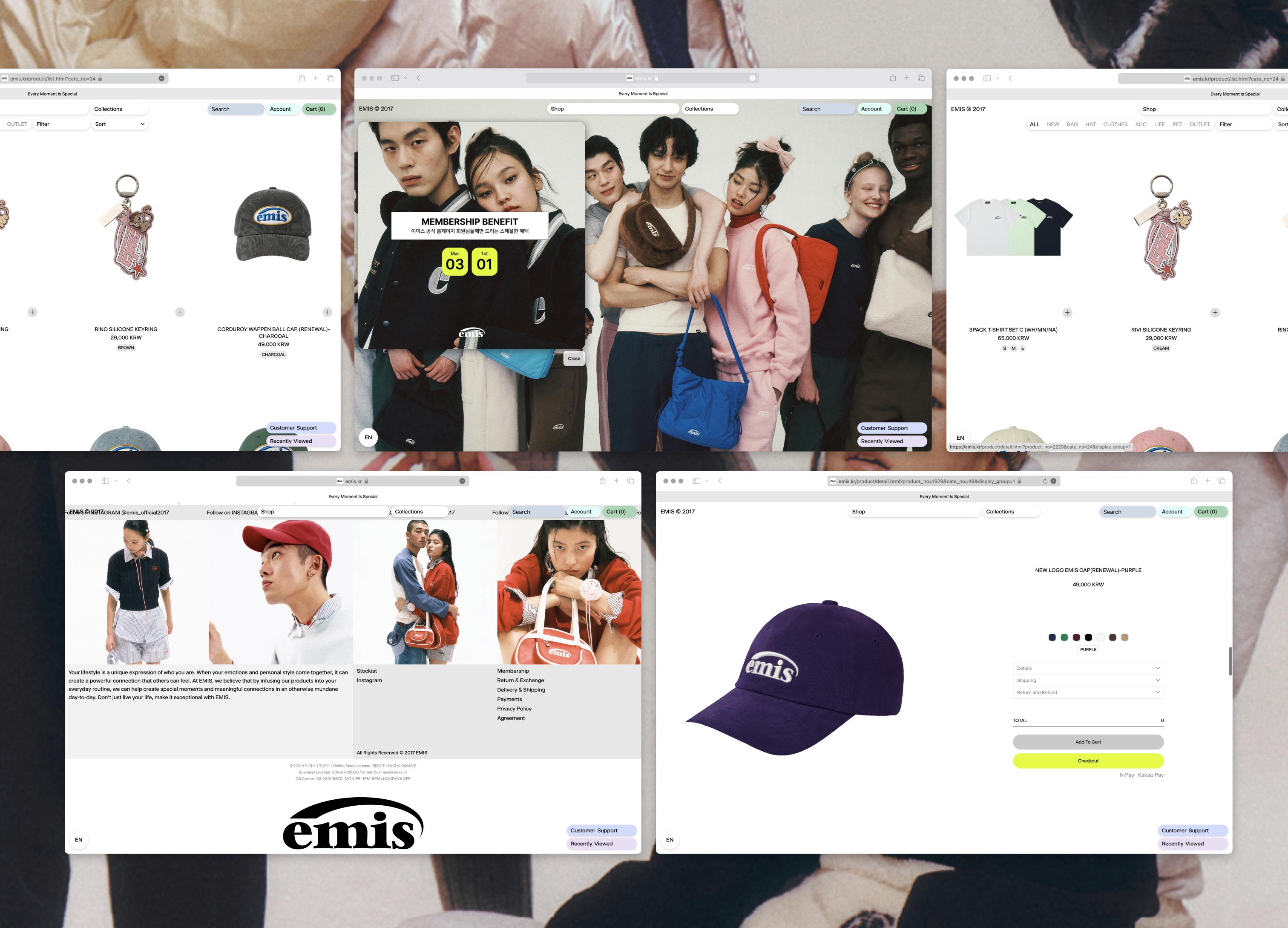
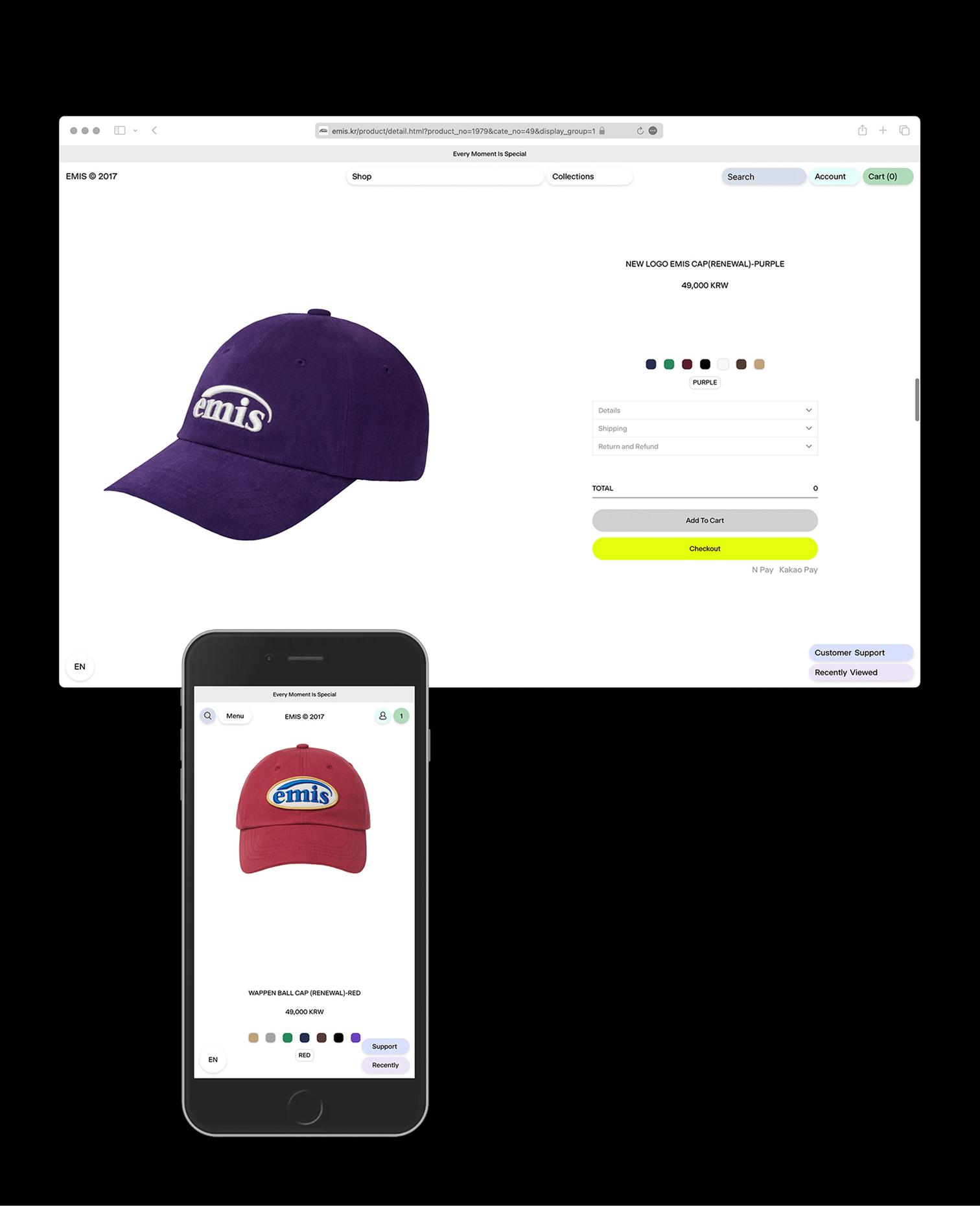
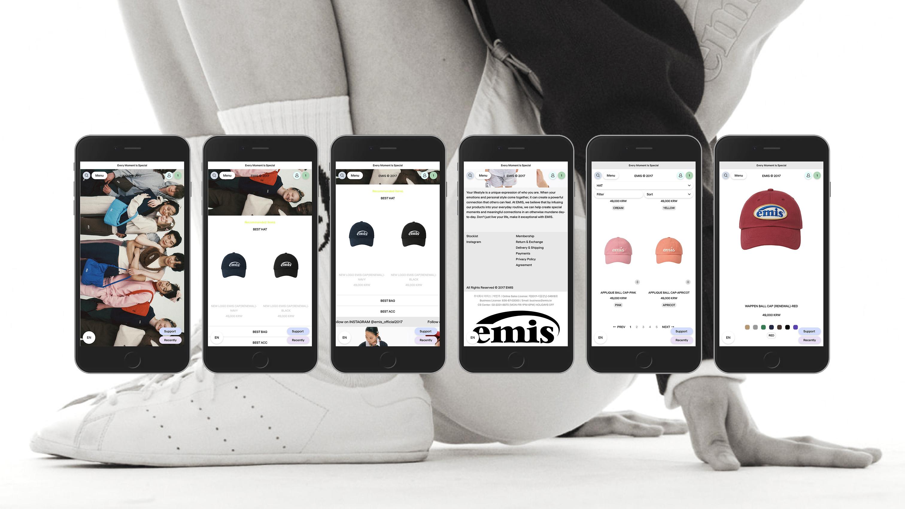
OTP Company designed navigation and information hierarchy around the sequence of finding, comparing and choosing products. We organized category navigation and color and size filters, connecting different colors of the same style through swatches so customers could move between individual products. We refined the flow for reviewing product names, prices, options and stock availability, and organized detailed information into product descriptions, sizing, shipping, exchanges and returns to make the information needed for a decision easier to find. The visual direction centered on “Comfy Stylish,” bringing together the comfort and expressive character of EMIS. We paired a balanced sans-serif typeface with colors drawn from the products, adjusting their tones to create a consistent impression across a varied palette. Guidelines defined color ranges for different interface areas and selection criteria for buttons that guide purchasing actions, translating the brand’s expression into specific UI rules. For the Korean e-commerce website, implementation connected the interface design with the practical work of registering and managing products. Operational guidelines covered product swatches, option displays and merchandising settings, as well as updates to Collection, Archive and seasonal banners. We documented the settings and editing procedures the team would use repeatedly, helping preserve the intended discovery experience as new products and content were added. After launch, we continued refining features and interfaces in response to operational needs. In 2026, we improved desktop and mobile category navigation and the visibility of subcategories, and added a mobile promotional banner area. We also differentiated guidance and consent interfaces for member and guest checkout, continuing to adapt product discovery, promotions and purchasing flows as the service evolved.
실행. 브랜드의 성격을 디자인과 사용성의 기준으로.
OTP Company는 고객이 상품을 찾고 비교하며 구매를 결정하는 순서에 맞춰 탐색 구조와 정보의 위계를 설계했습니다. 카테고리 이동과 컬러·사이즈 필터를 정리하고, 동일한 스타일의 다른 색상을 컬러칩으로 연결해 개별 상품 사이를 오갈 수 있도록 했습니다. 상품명과 가격, 옵션과 재고 상태를 확인하는 흐름을 다듬고, 상세 정보는 제품 설명·사이즈·배송·교환 및 반품 안내로 구분해 선택에 필요한 정보를 찾기 쉽게 구성했습니다. 시각적 방향은 EMIS의 편안함과 감각적인 개성을 함께 담는 ‘Comfy Stylish’를 중심으로 정리했습니다. 안정적인 산세리프 서체와 제품에서 추출한 색상을 조합하고, 다채로운 컬러가 일관된 인상으로 이어지도록 톤을 조율했습니다. 화면 영역별 색상 범위와 구매 행동을 유도하는 버튼의 컬러 선택 기준을 가이드로 정리해, 브랜드의 표현이 구체적인 UI 규칙으로 이어지도록 했습니다. 국내 이커머스의 구현에서는 화면 디자인과 실제 상품 등록·관리 방식이 연결되도록 했습니다. 상품별 컬러칩과 옵션 표시, 진열 설정뿐 아니라 Collection·Archive와 시즌 배너를 갱신하는 방법까지 운영 가이드로 정리했습니다. 새로운 상품과 콘텐츠가 추가되어도 기존에 기획한 탐색 경험을 유지할 수 있도록, 운영팀이 반복해서 사용하는 설정과 편집 절차를 함께 전달했습니다. 출시 이후에는 실제 운영에서 발생하는 요구에 맞춰 기능과 화면을 보완했습니다. 2026년에는 PC·모바일 카테고리 구조와 중분류 노출을 개선하고, 모바일 프로모션 배너 영역을 추가했습니다. 회원과 비회원의 주문 상황에 따른 안내와 동의 화면도 구분하며, 상품 탐색과 프로모션, 구매 과정이 서비스의 변화에 긴밀하게 대응하도록 유지 보완을 이어갔습니다.

Possibilities. Sustaining the Brand Experience through Everyday's Practice.
We built and deployed EMIS’s e-commerce websites for Korea and global markets, including Japan, and continued operational maintenance and improvements through 2026. By refining product discovery, purchase interfaces, global purchasing information, categories and promotional areas, our work extended from the initial build into everyday operations. Our aim was to make discovering an EMIS that resonates with each customer’s taste feel seamless and enjoyable, even within a wide range of choices. Whether selecting another color of a familiar product or exploring a new category, we sought to bring the brand’s variety together with clarity of choice. We hope that every return offers both the comfort of finding what one needs and the pleasure of discovering new tastes and combinations, making the everyday acts of finding, comparing and choosing products feel distinctly EMIS.
가능성. 매일의 움직임 속에서 이어지는 브랜드 경험.
EMIS의 국내 및 일본을 포함한 글로벌 이커머스를 구축·배포하고, 출시 이후 2026년까지 운영 유지보완을 이어갔습니다. 상품 탐색과 구매 화면, 글로벌 구매 정보, 카테고리와 프로모션 영역을 보완하며 초기 구축에서 일상적인 운영으로 작업의 범위를 이어갔습니다. 우리가 이 프로젝트에서 지향한 것은 다양한 선택지 안에서 고객이 자신의 취향에 맞는 EMIS를 발견하는 경험이 매끄럽고 즐겁게 이어지는 것입니다. 익숙한 제품의 다른 색상을 고르거나 새로운 카테고리를 탐색할 때에도, 브랜드의 다채로움과 선택의 명료함이 함께 이어지도록 했습니다. 고객이 다시 방문할 때마다 편안하게 상품을 찾으면서도 새로운 취향과 조합을 발견하고, 찾고 비교하고 선택하는 일상적인 행동 자체가 EMIS다운 경험이 되기를 바랍니다.



E-commerce Strategy & UX Planning
Design Concept & Color System
Desktop & Mobile UI Design
Cafe24 E-commerce & Custom Feature Development
Korean & Global Market Adaptation & Deployment — Including Japan
Product, Content & Operations Guidelines
Ongoing Maintenance & Feature Enhancements
- 이커머스 전략 및 상품 탐색·구매 여정 기획
- ‘Comfy Stylish’ 디자인 콘셉트 및 컬러 가이드
- 데스크톱·모바일 UX/UI 디자인
- 카페24 기반 이커머스 구현 및 커스텀 기능 개발
- 국내 및 일본을 포함한 글로벌 이커머스 적용·배포
- 상품·컬러칩·진열·브랜드 콘텐츠 관리 및 운영 가이드
- 출시이후 2026년까지 구매 화면·카테고리·프로모션 영역 유지 보완

Project Lead,
Strategy & Creative Direction,
E-commerce Planning, UX/UI Design & Development,
Deployment & Ongoing Maintenance
OTP Company
Development Collaboration
Jinyoung Park